Like the Handbook? Support it.
I've spent quite some time assembling this handbook, and if it works well for your company and you use it in your training, I'd be very happy to get a donation for it. Just hit the Paypal button below to show some love.
Get a printed copy or ebook version
The Developer Evangelism Handbook is now also available as a print copy from Lulu.com.
New Version!
This is the original 2009 version of this handbook and quite a few parts are outdated. There is a new version available at Developer-Advocacy.com if you want to get more up-to-date information
Prepare great slide decks for presentations
Slides are a tricky thing to get right. The main problem with them is that as a developer evangelist you have a technical audience (in most cases) and slide decks are anathema to us. The term "death by powerpoint" is much more than a Dilbert cartoon. Sadly enough a lot of our day to day life in offices consists of sitting in a room trying to look alert whilst slowly dying inside as some old-school presenter shows us just how many bullet points you can cram into one slide.
Again, as with the other chapters a lot of what you will read here will vary for your experience and environment but I found the things I am sharing here very helpful in my quest to bring technical goodness to the starving masses of under-appreciated developers. Furthermore, I got a lot of good feedback and high viewing figures on SlideShare for my slides which can be an indicator that I am doing the right thing.
Know your stuff
The biggest mistake that presenters do is to rely on their slides as their main source of information. If you don't know the subject matter or you are not excited by it or you haven't done much work with it you will give a bad presentation. Nothing makes you a better presenter than confidence in the subject and hands-on knowledge.
You will sooner or later be asked to stick to company approved material or "re-use this great deck XYZ has done". Try to avoid this as much as you can. A presentation is you telling people about what you think is important that they hear about. If you have no clue what the issues with the product are or if you don't really care about it you will get into trouble. Technical audiences are amazingly good in spotting what you don't know and will make that the first question in the Q&A session. It is a geek alpha male thing and you will have to be prepared for it.
There is nothing more painful than a presenter turning to his slides and reading out what is standing there. You don't want to become the people that bored you to death before. Also, as mentioned in the "Deliver a talk or workshop" chapter, audiovisual equipment hates presenters and your slides might not be available for you for one reason or another. If you know the subject matter and you are excited to talk about it you will give a memorable talk regardless.
Furthermore, this is you presenting. If the slides are not your style or your language you will appear stilted and you have to remember what the deck says. Public speaking is about giving information in an entertaining fashion – not acting. You should not have to play the role of "corporate speaker" but instead be you. Only then you will be believable and effective. More on this later.
Start with the content – not the slides!
The first mistake people make is to see the slides as their presentation. The slide deck is an aid to make your presentation easier to take in and more enjoyable for the audience. For you as a speaker they are the narration thread – a reminder of what you want to cover in your talk. A good speaker can keep a room of people interested without any slides whatsoever. A good slide deck, however, gives people memorable moments and information they might miss if they just listened to you.
Start with a highly portable format – HTML
When I write a new slide deck I start with a text editor. I write the story of my presentation and I follow the same rules as for writing online articles. That way I make sure of a few things:
- I know the content and the extent of what I want to cover – which also allows me to keep to the time limit when presenting.
- I have the information in a highly portable format for people to read afterwards – by converting it to HTML later on or blogging these notes.
- I already know all the links that I want to show and can create easy-to-find versions of them – for example by bookmarking them in Delicious.
- I don't get carried away with visuals and effects – which is a big danger when you play with good presentation software.
Tip: Having these notes makes sure that you will have something for people after the presentation to read. You can mention this before your presentation and give them the URL. This relaxes audiences immensly as the first question at every conference I get is whether the slides will be available or not.
Pick a presentation tool that helps you present
Once you know the content, you can start putting together your slide deck.
Choose whatever presentation tool that makes you happy and allows you to simply put your slides together. Personally I use Keynote, but if forced I can also stick to PowerPoint.
There are a lot of presentation tools out there that work with HTML and in browsers and use web standards. I've written one of these myself in the past as it was the thing to do (Opera even comes with one built into the browser). Over the years I found them all to be sub-optimal. The reasons are the things a presentation tool has to do for you, which are:
- Display your slides on the screen regardless of resolution – some projectors support 800x600, others go up to 1280x1024.
- Use, crop and resize images easily – you will use a lot of imagery and it is never in the right format.
- Allow you to position elements freely on the screen – sometimes you need things next to another, sometimes you need to overlay a URL over an image.
- Support remote controls – as you should walk around during your presentation you should be able to use a remote control instead of hitting the space bar.
- Have a way to transition smoothly from one slide to another – this is a subconscious thing but it makes your slide presentation so much more enjoyable.
- Be full-screen – browser bars or copyright lines and headers are distracting the viewers.
- Have a way to blend things in one at a time – this helps your narration and you don't need to repeat content in several slides.
I am sure giving enough time all of these are possible in browser-based presentation systems, too, but why bother wasting time on this when there are perfectly capable systems available?
Tip: whilst Keynote is the bee's knees when it comes to functionality and style, the file format it creates (essentially a packed folder) is a pain to send to other people. Either you have to zip it up or – if you just need to hand out the deck without further editing – export it as a PDF. When you export make sure to uncheck "Print each stage of builds" and "Add borders around slides".
Illustrate, don't transcribe
Once you wrote your content and picked the right tool it is time to write your slides. As mentioned before, what you should remember here is that your slides are not your presentation but its outline. The slides are there to keep your narration flowing and illustrate to the audience what you are on about at this point in your talk.
Human communication is to a large part body language and you standing there and reading from your slide deck or –even worse– turning away from your audience to see what happens on the big screen is communication suicide.
In addition to that it means that you cannot concentrate on the audience. Checking the audience and their body language is a large part of giving a good presentation. It is not about you celebrating yourself and giving a show but about you bringing information to the audience in an engaging and interesting way. You can only do that when you can see the effect you have – not when you have to read what you want to say.
Thus you need to find a single sentence or even a word, a picture, a screenshot, some graph or some illustration that explains and accentuates what you want to talk about in this segment of your presentation. That way you don't overwhelm the audience with things to read and look at but you enable them to concentrate on you and you enable yourself to be free in your delivery and – if needed – alter your delivery style to stop the audience from nodding off or leaving.
Let's have a quick example. The following information is what I had in my notes:
The way to have fun with the web of data is to distribute ourselves around the web and bring the data back to our sites.
The first step is to spread our content on the web:
- upload photos to Flickr
- bookmark and tag URLs atDelicious
- write short and succinct news updates at Twitter
- upload videos to YouTube
- link addresses and set up driving instructions with Google Maps
- write CVs and bios at Xing or LinkedIn
The benefits of this approach are the following:
- The data is distributed over multiple servers – even if your own web site is offline (for example for maintenance) the data lives on.
- You reach users and tap into communities that would never have ended up on your web site.
- You get tags and comments about your content from these sites. These can become keywords and guidelines for you to write very relevant copy on your main site in the future. You know what people want to hear about rather than guessing it.
- Comments on these sites also mean you start a channel of communication with users of the web that happens naturally instead of sending them to a complex contact form.
- You don’t need to worry about converting image or video materials into web formats – the sites that were built exactly for that purpose automatically do that for you.
- You allow other people to embed your content into their products and can thus piggy-back on their success and integrity.
The two slides that went with the information above where the following:
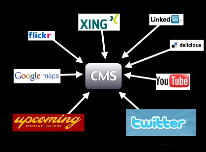
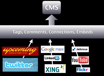
Instead of telling all of these things, I gave people a visual, using the logos of the companies as something they already know and showing with a few arrows what I want to bring across. I was able to talk through the services one by one and say what people can do with them. The second slide then showed the benefit of piggy-backing on the integrity of these services. Add a practical example of what can be done with this approach and you have yourself a great segment of a talk.
Use and find images
Images can be a very good way of getting a message across. You've probably seen beautiful presentations with inspiring pictures of swooping eagles and calm waterfalls but this is becoming cliché really fast.
I use images for two reasons: to have something unexpected and fun (yes, mostly kittens) in my slides or to connect to a real life scenario.
Example: When giving a security talk unstead of showing a web site with a security flaw I show a lock that has been picked, or a badly locking door, or something similar that bridges the gap between a hard to grasp concept and something that is obviously a problem or a bad solution. If I talk about badly implemented accessibility I don't show ugly web sites but a wheelchair ramp with a step in it or a wheelchair accessible toilet behind a door that is too narrow.
Use imagery to illustrate your point, not to "make it pretty". Pretty imagery might be more distracting than helping and for making it pretty you got colours and typography.
Finding images to use these days is easy. A free and good resource for images is Flickr. Make sure that you use the advanced search and that you tick the boxes for Creative Commons licensed photos that you are allowed to use commercially, manipulate and build upon. The latter is needed if you want to crop the photos.
Example: Say for example you want the photo of a lock, check this search link. Each of these photos you can use in your slides and all you have to do is to thank the original photographer by mentioning them by name. I normally include the URL of the photo on Flickr in the slide, too, so that other people can re-use the photo if they want to.
No need for expensive stock photography of multi-ethnic people in suits high-fiving or shaking hands - tap into and participate in Creative Commons and we all have more interesting slides.
Screenshots are amazingly powerful. Instead of just pointing out a resource on the web your audience can check later, make a screenshot of the web site and overlay the URL on the slide. That way people have a visual idea of what the resource looks like and get a much stronger "Oh I remember this" moment when they visit it.
The same applies to interfaces of systems - if you show and explain you reach more people than when you just explain.
Tip: For creating screen shots I use Skitch, which is not only terribly easy to use, but also allows me immediately to add some arrows and explanations and upload the final product to Flickr.
About code examples
Code examples are what a lot of presenters spend far too much time on getting right. You want a good mix of readability and at the same time make it easy for you to change the code. Presentation software by default is not meant for code display. There is no monospace setting, quotes get replaced by "smart" quotes, indentation is all wrong, you have less space than in your code editor and many other problems.
Code examples are however very important as they show people how they can immediately use what you are talking about and you bring the topic you cover into an area where they feel home as they use it daily anyways. Showing a few lines of code and what they do in a browser is much more powerful than ranting about the amazing features of the product you talk about. It comes back to the "what is in it for me?" that you should always try to answer with your evangelism.
Here's what I do: I write the code in my normal editor (TextMate), bump up the font size a bit and then take screenshots. This has a few benefits:
- I have nice colour coding which increases readability and helps understanding the code.
- I have the right font and code layout and none of the "magic quotes" annoyances.
- I maintain the code in one spot and a code change means simply having to create another screen shot.
Provide live demos and downloadable source packages of your code as explained in the "Write excellent code examples" chapter and everybody wins.
About sound and videos
Sound and video are powerful tools for training and illustrating. For example I found that a two minute screencast of some system makes it much easier for people to find their way into a system than lots of clever copy (which you'd need anyways cause not everybody can see and hear video).
In presentations, however, I find it more distracting and anything else. Yes, it enriches your slides and teleports you into the post 1990 presentation league (and on Macs it even works), but let's face it – it is also terribly interupting.
As a speaker you normally want to be the person listened to. You also can use your body language to emphasize the message you want to give. From time to time you point out information on your slides but you bring back people to your narration. If you use music or video in a presentation you create a pause as all the senses of the audience are busy following what is going on on the screen. It also creates some time in your presentation where you are part of the audience as you turn and watch the screen (facing the audience while they watch a video is creepy).
Given the disruptive nature of multimedia elements I try to avoid them whenever I can. They look cool but you'll find soon that they are more hassle than they are worth. For example:
- You expect the AV equipment of the location you give your talk to be able to show video and have audio for you and your computer (good luck with that one).
- You expect the projector to be able to show video. Especially with windows machines and older projectors video is often not visible because of refresh rate issues.
- You make your slide deck impossible to distribute unless you turn it into a video.
- You lose the rhythm of your talk, in essence you create a break that you need to pull the people out of again.
That doesn't mean you cannot talk about videos and screencasts. I normally upload them to YouTube, take a screenshot of them and show them as a slide together with the YouTube URL (which I can link and also provide in the HTML notes). That way you can talk about the video and don't lose five minutes of your presentation. You can also explain what happens in the video and how it is relevant to what we are talking about. That way people who can't see videos still have an idea what is going on here.
Example: one exception to my rule is when you want to provoke a very emotional response and make people understand something beyond their own experience that is very human. One example is that when I talk about the accessible version of YouTube I created. Rather than me explaining what effect these changes to the interface had it is more powerful to show how Lizzie, a user with learning disabilities and Kirin, a blind user can now enjoy online video. Especially Kirin's end sentence "The thing is the power … this has given me the power that it should give me in the beginning." is a wonderful emotional moment to get you back into your talk.
If you really feel that you need to use video or audio in your talk then use it at the beginning or the end of it. That way you either come in as a spectator and become the speaker or get out on the same level as the audience.
In most cases video and audio are extra bells and whistles. And a good talk doesn't need those. This also applies to transitions and effects.
Don't bling it up
As mentioned before in this book you can put lipstick and a wig on a pig but it still would make a lousy date. A lot of presenters are happy to use every transition and animation the presentation software comes with but that doesn't make it better – especially when they look bad on a slow computer.
Animation rhymes with moderation and this is what you should always keep in mind. You want to make a point with your presentation and not overload the audience with whooshes and blinking shiny things that distract from your content.
Use transitions to make your slides smoother, use animation if you want to reveal something bit by bit and avoid having to jump from slide to slide.
Example: I like to use "fade through colour" as the transition effect between my slides which smoothly fades in and out in a second. I only use animation when showing screen shots and showing zoomed smaller parts overlaid or to focus on one part of an interface.
Used correctly, animation can be a very powerful tool to make a step by step process more obvious. If you are not skilled in usability and design though it will most likely appear tacked on and, yes, tacky as animation has been traditionally used to spice up very boring presentations.
The other issue is that animations can actually work against the flow of your presentation. Sometimes you want to speed things up and if you hard-wired long and complex animations you stand there waiting for your slides to catch up with your narration. Sometimes you also have AV equipment that cannot show animations and that makes you wait for something that never happens.
Example: when I was in Madrid, my talk was streamed on a video service of the university which meant the streaming server had to VNC into my laptop. As everything is wonky over VPN neither the animations nor the transitions worked.
One thing you can do is use overly outrageous animation in an ironic manner to show how annoying they can be. I've done that before when talking about accessibility or using JavaScript libraries. Only to be used in countries that understand irony though.
Keep it brief
Keep your talks brief and if possible cover one topic. If you need to cover more than one make sure that you have a good narration flow from one to the other to avoid them appearing stitched together.
Presentations should bring home one message and that one well. This could consist of several sections but the overall story should be obvious. Try to give the whole talk one main theme and return to this in each of the sections.
As mentioned earlier, your slides should contain only what is necessary and not more. There is no point in reading from your slides as that would make you a member of the audience and you have a race who can read it faster.
I tend to have either only a theme per slide or one sentence (depending on the audience, which is the next section in this chapter) and I try to avoid bullet-lists at all costs – especially nested ones. These are old school presentation style and conjure up unpleasant memories of having to sit through two days of boring training sessions.
An agenda up front is a good idea if you really cover a lot of things but it also allows the audience to pick their faves and shut down in between which probably means they miss important parts of your talk. If you do a good job as a presenter the amount of slides is not a problem and neither is at which stage of the overall talk you are. People will be lead through it without realising it.
The overall amount of slides is only limited by your ability to go through them quickly. My rough estimate is a slide (which is one topic) a minute but I am also a very fast speaker.
Consider the audience
One instance where I break my own rules of brevity is when the audience consists of people who do not speak English well and might have a harder time keeping up with my pace and the funny accent. When dealing with an audience like this, having a simple sentence per slide or even some bullet points and repeating them has quite an impact.
- You keep things much more simple and thus you don't make the audience feel inadequate or that they are missing important things.
- You are forced to pace yourself which is very important with an audience like that anyways.
- You allow for better translation in case you get transcribed afterwards or have live translation at the conference.
In these scenarios (and especially in the Asian market where asking questions in front of a big group is just not normal) I also tend to keep my slides much more technical. Code is international and people can even repeat it easily and write essays about it in their own languages.
Another thing to remember when giving presentations in different cultures is that pop references and puns do not work. Don't expect the audience to know what you know and to be excited about what you are excited about.
Example: When I went to Sweden to give a talk I put in some slides about the Swedish Chef from the Muppet Show (here in my favourite sketch of all time – "Chocolate Moose"). Nobody got it as the chef is not called Swedish in the Swedish version of the show. I also added a "have a break, have a Kit-Kat" joke in there, and this was another ad only aired in the UK (I only knew it from "world's funniest TV ads" on German TV).
As said at the beginning, a lot of the tips here are for creating presentations for developer crowds. If you speak mostly to designers or management, other tactics have to be applied. All in all it is a good idea to question the classic way of presenting and slide design though.
Corporate and conference templates
During your job as a developer evangelist you will be asked to use conference or corporate slide templates. Try to avoid doing that. The reason is that these templates are almost all the time targeted to the classic presentation style of one heading and 20 nested bullet points followed by a copyright line nobody cares about and other legalese things.
The reason is that using a corporate or conference template is good for the conference and the company but distracts you as a presenter – it is just not you. You and only you should own and run the presentation as it is your integrity on the line. Once a conference or company asked you to be a speaker for them they already trust you to do things right and there is no need to keep the corporate hat on and do a song and dance.
That said, there is a benefit to using these templates. In the corporate case you show a consistent look and feel to the world and align yourself with other publications. The question is if you want that. In my case, not looking like the slide decks of my company battles a lot of prejudices developers have as developers do not trust big brands. This is for you to decide. In the case of a conference looking the same as the others makes your deck more findable later on but at the price of looking the same as everybody else and having a distracting logo on each slide.
The solution is to meet half way. If you make the first page of your deck align with the others and then switch to your own style everybody wins. The cover sheet of your deck is only important in two cases:
- To fill the screen until your talk starts and
- as an eye-catcher when you later on send out the deck and show it in a blog post.
Other than that the slides should take the backseat and aid your presentation.
Don't reuse without personalising
Another very common thing that will happen to you once you become a speaker for your organisation is that you will be handed presentation decks to present. "This has been done by Stephen from the US office and has been signed off by PR. Stephen can't come to the conference, so we want you to fill in for him. Here are his slides, good luck." is a sentence you will hear a lot.
If that happens to you, be firm and say that this is not how it works. You are a presenter – not a parrot. If the slides are not in your language, mirror your approach to a certain topic or talk about technology or products you are not firm in or have no control over you are treading on very thin ice. It is you on the line as the speaker and the success of your talk stands and falls with how you come across. If you can't be you, then don't do it.
Example: This happened to me when Yahoo came out with the open strategy and our chief technologist couldn't come over for the Future of Web Apps London. Here are the slides where I refer to Neil's slides and the video of the talk. As you can see, there was no way I can present his deck as our styles are totally different.
That said, nothing stops you from using the information on the slide deck and translate it to your "language". Instead of flat out refusing to use the deck say that you are happy to take over and use the information but that you want to have a chat and information hand-over from the original author. Every speaker has extra information that makes slides make more sense and become more appealing and you cannot guess these things – you need to hear them "from the horse's mouth".
It boils down to this: giving the talk is one half of the whole show. You will have to answer questions and you will have to be able to explain the practical implementation of a certain technology or product. This you can only do when you played with it yourself and verified your findings with an expert.
Slide decks that get re-used without being challenged and changed become stale. For a company it makes more sense to keep a repository of facts and ways to explain a certain product than full slide decks. That way your information doesn't become stale. Wikis are perfect for that.
Share and enjoy
Once you're done with your slides and you are happy with them don't forget that sharing is caring. Upload the deck to your blog, make it available as a download or – even better – upload it to Slideshare.
Slideshare is a great tool to get your slides distributed. People can comment on them, share them with friends, embed your slides in conference blog posts or as a resource for a certain subject and many things more. It is what Flickr is to photos and YouTube is to videos.
Example: All my slides are available on Slideshare: http://www.slideshare.net/cheilmann/presentations and a lot of people re-used them in part in their own presentations.
Sharing your slides is what a lot of people in the audience will ask you to do and it will get you known as a speaker. People may stumble upon your decks somewhere else and learn about you that way.